Flat design has become a popular form of illustration over the last 12-18 months, being used in everything from corporate communications to entertaining infographics. The style relies on reducing images close to their simplest form, resulting in striking and minimalist illustrations that work beautifully without the need for extraneous detailing.
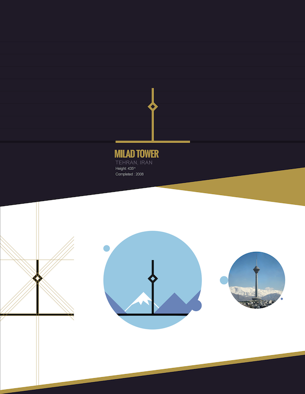
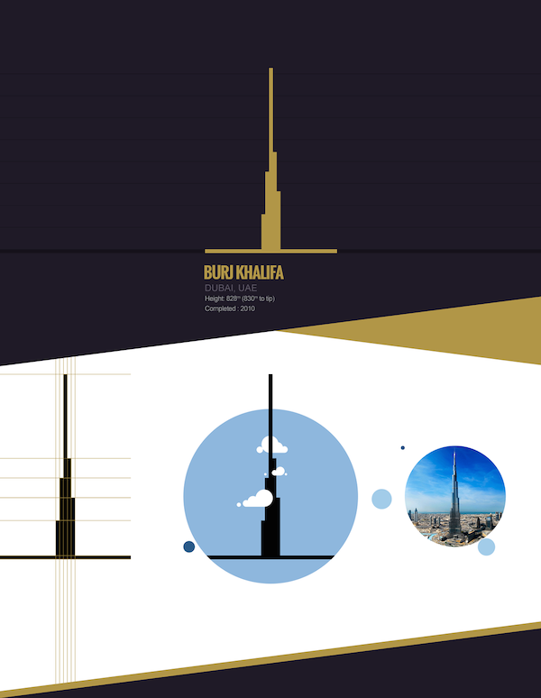
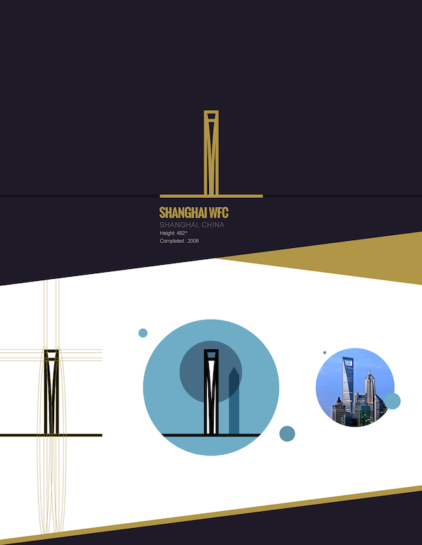
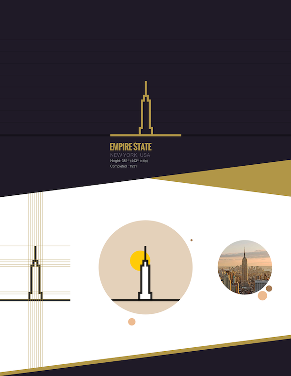
Some designers however have been looking to take flat design a step further, reducing images to simplest possible form, whilst still remaining recognisable. One such designer – Farshad Aref-Far – has utilised simplified line drawings to visualise the world’s most famous skyscrapers, illustrating them using a simple combination of boxes, lines and circles.
You can see some examples of his work below:




Leave a Reply