
Share This

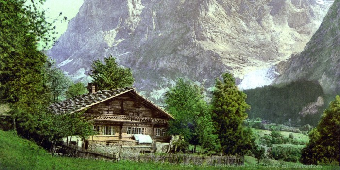
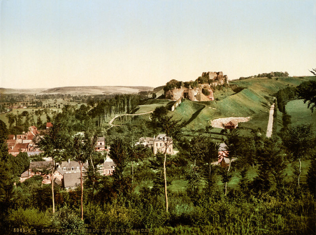
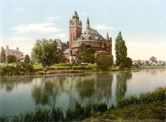
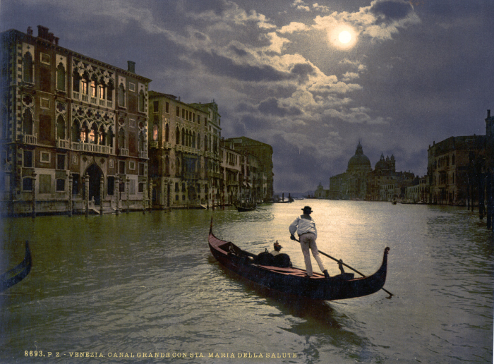
Photochrom, invented in the 1880s by Hans Jakob Schmid, an employee of Swiss printing company Orell Gessner Füssli, was one of the early techniques for colourising black and white negatives.
It involved long exposures and a complicated, technical and laborious chemical process for transferring the monochrome negatives onto stone lithographic plates. Demand for these colour images was at its highest between 1890 and 1910, when commercial colour photography was still untenable. The process produced millions of postcards until World War One, after which it was mostly used to create posters and art reproductions.
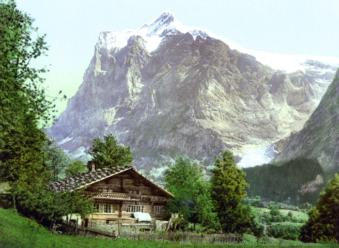
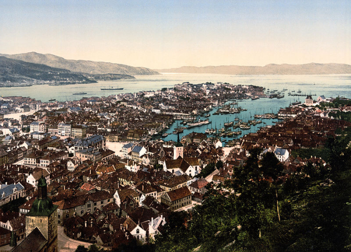
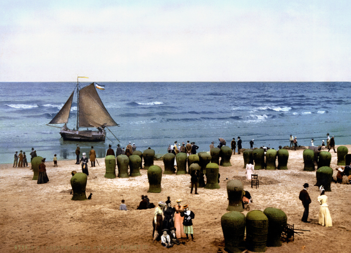
The images are compelling now, for being clearly from another time, and for the specific colouration which looks unnatural, strange but somehow beautiful. They are reminiscent of hand-coloured postcards from the Victorian era, when black and white images were preciously tinted with a fine brush, but in the case of the Photochrom postcards, the colours are in sharper focus. It is not an accurate representation of physical reality, but as it was an attempt to be as such, neither is it a purely artistic process, describing reality in an alternative and almost painterly way. This it does sort of by accident. It is this uncontrived and accidentally altered vision of the world around us that is intriguing. When we look at images like this, we see the world, quite literally, in a new light.


Leave a Reply