
Share This

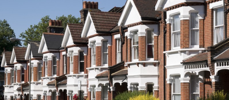
Property service Find Properly has produced an interactive tube map, showing how rental prices in London change as you travel down the tube.
The infographic, which is included below, shows the average rental cost for properties within a 1km radius of each stop. You can alter the chart to show prices for properties with more or fewer bedrooms using the menu at the top, and each brand of the line will show below the chart so you can alternative behind them.
If you’re interested in viewing properties in a specific area, simply click on the appropriate tube stop to be taken to the page on the Find Properly website featuring those properties:
Infographic courtesy of Find Properly.
Please note a couple of stations have been dropped off the DLR and District lines in order to make the map readable.


Leave a Reply