Pretty Posts
- Vibrant Colour Wheels Depict Books and Films with Colourful Titles
- A Scale Model of the Solar System Complete with Planetary Orbits
- Happy Birthday Martin Puryear, Why Didn’t You Just Get Your Sculptures Out of a Skip?
- Messier 15 Photographed by the Hubble Telescope
- After ‘Burn The Witch’, 5 of the Best Animated Indie Music Videos
Producing a typographic series is a staple job of graphic designers. Aside from drawing letterforms digitally or on paper, designers occasionally find characters in existing objects, or build them somehow. The alphabet has less often been a subject for fine artists, but this hasn’t stopped the extravagantly named Lola Dupre from exploring typography through her fine art practice.
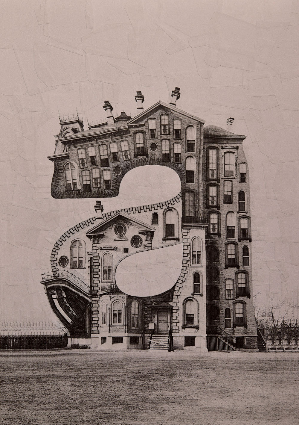
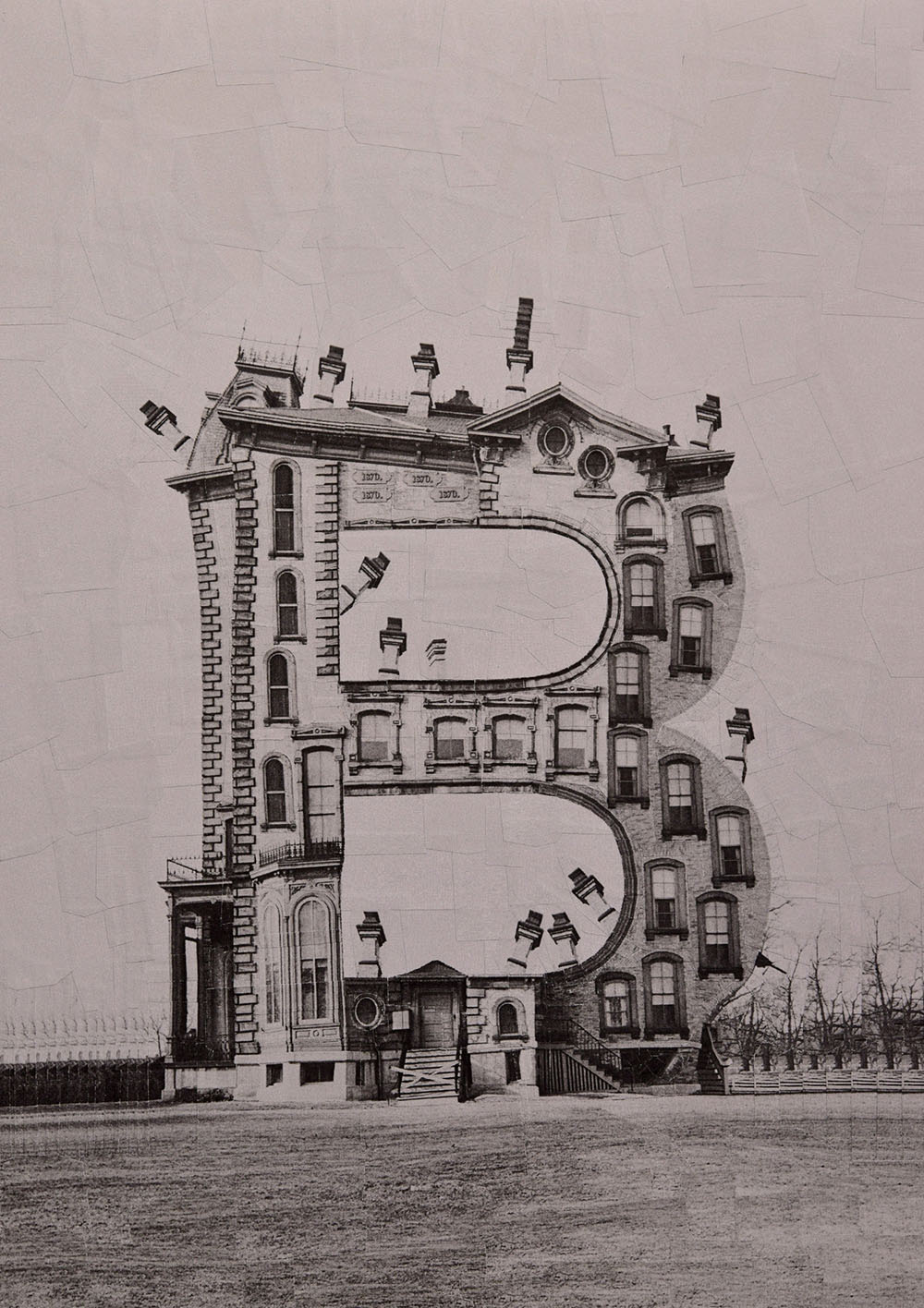
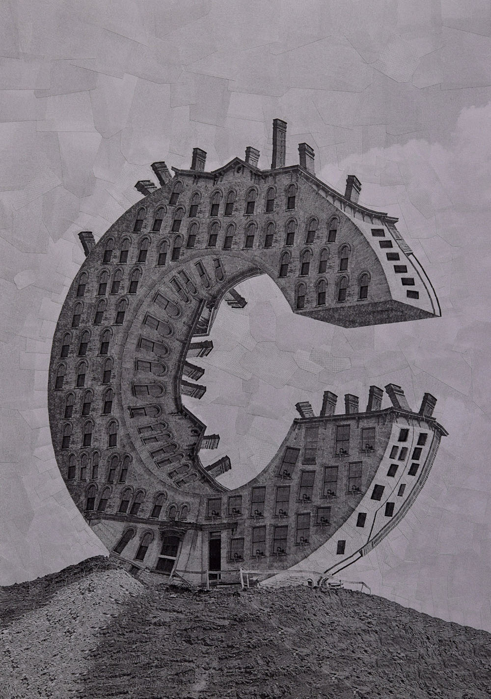
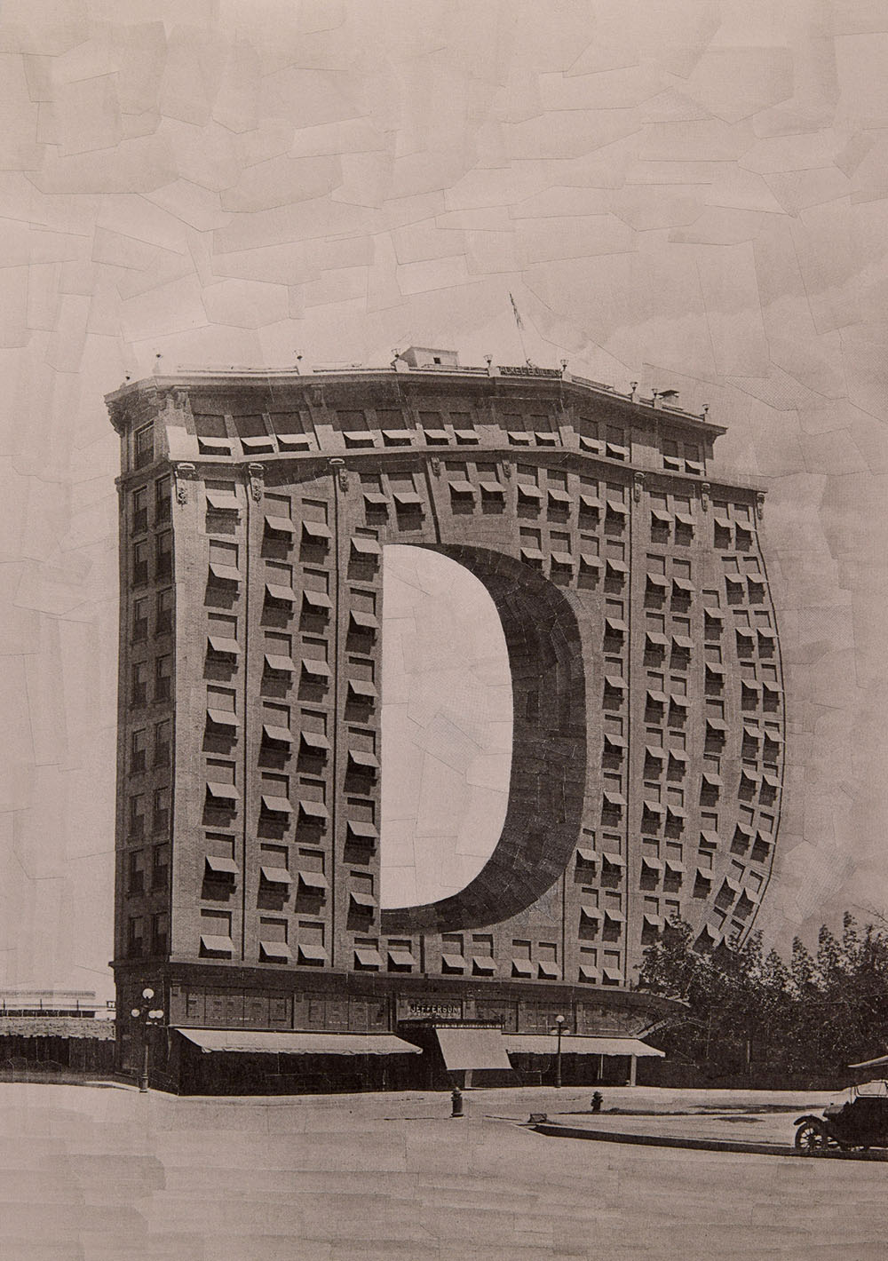
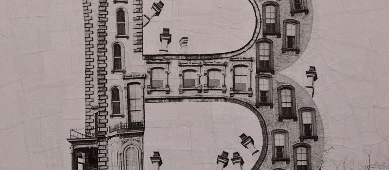
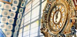
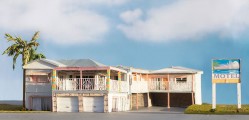
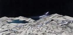
Lola specialises in a particularly inventive and intriguing form of photo manipulation. The edits are not to enhance the image as much as transfigure it in such a way that the final image is something otherworldly that could never be caught through a camera lens. In this series, she has created ‘alphabuildings’ – an alphabet made out of architectural features cut and pasted together seamlessly to create imaginary architectures that would never be built. Her images play with scale, making the alphabet seem monumental rather than miniscule. They also make what can be quite a mundane subject matter very much extraordinary.
Much of her work owes a debt to the surrealists. Her online portfolio is chock-full of the weird and the wonderful. Fragmentation, distortion and repetition are common themes being explored. Have a wander along alphabet street below, and then head on over to her website to see more eye-boggling constructions.



Leave a Reply