
Share This

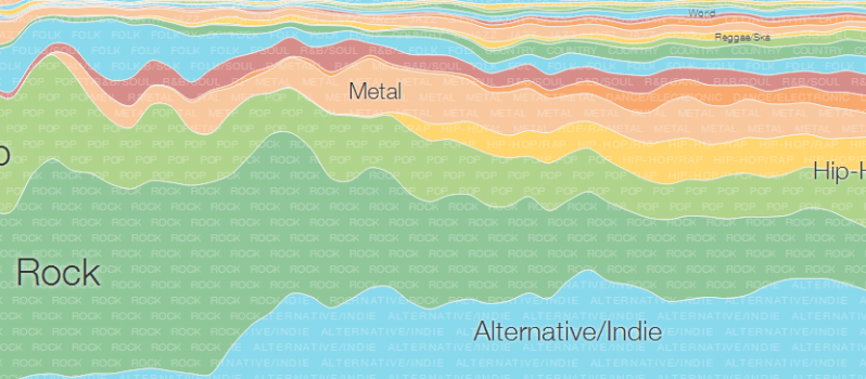
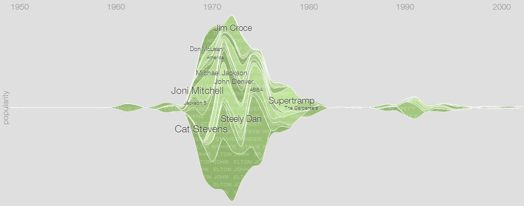
Search giant Google have launched an interactive music timeline, displaying the popularity of different genres, sub-genres and artists over the last 60+ years.
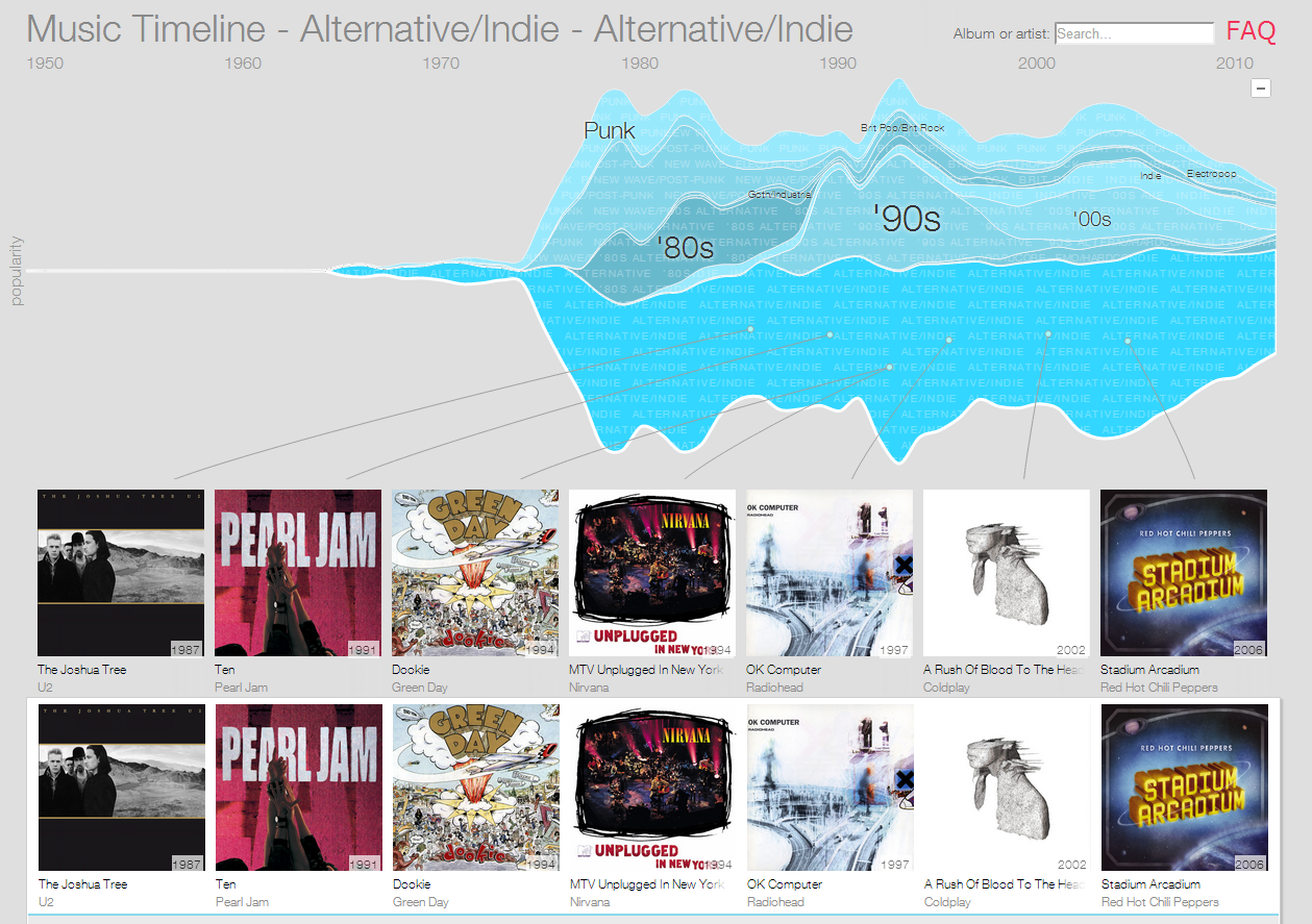
The interactive visualisation uses aggregated data from Google Play Music to show musical popularity over time, breaking the music world into genres initially, and then allowing you to drill down to sub-genres and then into individual bands and artists. The timeline uses an audio wave format to show popularity, with the most popular genres, bands and artists being displayed at a higher ‘volume’:
The visualisation also shows popular albums from the time period / genre, and allows you to click through to Google Play Music to either listen to a demo of the album or purchase it:


Leave a Reply